
Components
Every entry point below is served from Configure and runs in production today. Two scripts carry all of them: https://configure.dev/js/configure.js gives you the Configure.* functions, and https://configure.dev/components/configure-components.global.js defines the raw elements. Include each once per page.
publishableKey is your pk_ key, safe in the browser, and agent is your agent handle. Both come from npx configure setup --users. displayName is what the user reads; agent is the identity every approval and token is bound to.
Composer button
The entry point for a chat. It sits next to the image and file attachments as a + menu, with a Personalization row that opens Configure's hosted flow inline. Pass linkEl so the flow mounts in a dismissible panel across the assistant lane instead of inside the composer row.
html
<script src="https://configure.dev/js/configure.js"></script>

<div id="configure-entry"></div>
<div id="configure-link-host"></div>

<script>
  Configure.personalizationButton({
    el: "#configure-entry",
    linkEl: "#configure-link-host",
    publishableKey: "pk_...",
    agent: "your-agent",
    displayName: "Your App",
    theme: "light",                 // or "dark"; omit it and the script warns and follows the system
    onImage: () => openImagePicker(),
    onFile: () => openFilePicker(),
  });
</script>
Let the link host span the assistant message lane. Do not cap it at 420px; the flow needs the width.
Your own button
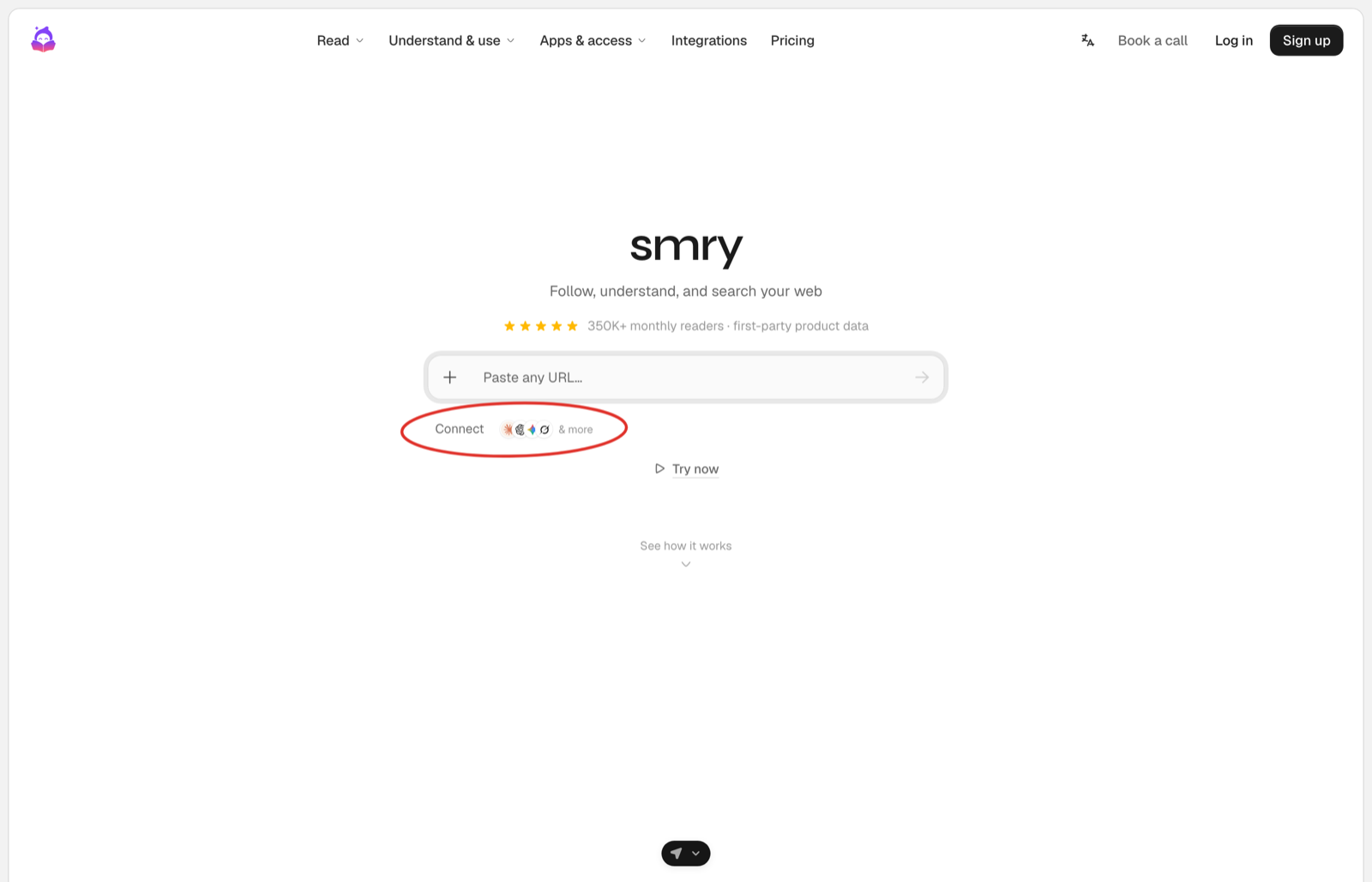
Most products already have a button style, a sidebar, and an onboarding step, and the entry point there is your own control that does one of two things. In a chat it sends the fixed message and your server answers with the card. Outside a chat it goes to the route that sends the user to Configure's page.
html
<button id="connect" type="button">Connect</button>
<script>
  document.getElementById("connect").addEventListener("click", () => {
    sendMessage("I want to securely connect my context");   // the fixed message, step 3 of the Quickstart
  });
</script>
html
<a href="/onboarding/connect">Connect</a>In onboarding or settings. The route mints the link with a returnUrl and redirects. Configure brings the user back connected. See Onboarding.
sendMessage is whatever your chat already uses to send a user message. The message is fixed on purpose: the user never has to know what to type, and your server never has to guess what they meant.
Integration button
For a settings or integrations surface, the raw element renders a connect or manage control that opens Configure's hosted flow itself.
html
<script src="https://configure.dev/js/configure.js"></script>
<script src="https://configure.dev/components/configure-components.global.js"></script>

<configure-personalization-button
  variant="integration"
  external-id="user_123"
></configure-personalization-button>
variant is menu, the composer button above as a raw element, or integration. With manual the element announces its events and never opens the flow, which is how the demos on this page run.
Hosted link
When you want the flow on its own, mount it and take the token from the event. This is the same grant the composer button and the integration button run; here your page owns where it renders.
html
<script src="https://configure.dev/js/configure.js"></script>
<div id="configure-link"></div>

<script>
  Configure.link({
    el: "#configure-link",
    publishableKey: "pk_...",
    agent: "your-agent",
    displayName: "Your App",
    theme: "light",
    onEvent: (event) => {
      if (event.type === "configure:linked") {
        // event.payload = { token, userId, tokenUse }
        sendTokenToYourBackend(event.payload.token);
      }
    },
  });
</script>
Configure.link() returns a frame handle, not the token. The token arrives in configure:linked, through onEvent or as a DOM CustomEvent on the mount element. Send it to your server and use it there with configure.profile({ token }).
Connected
The composer button flips its own state when it sees the link complete on the page. Across reloads, and for your own button, render the connected state from what your server already knows, which is the linked your daily refresh stored beside the context.
ts
// The refresh in step 5 stores `linked` beside the context. Render from that.
const { linked } = (await store.get(user.id)) ?? { linked: false };
const label = linked ? "Connected" : "Connect";
Caching Configure's answer is fine, and it is what keeps a page render off the network. What is forbidden is a flag your app sets from its own events: store what Configure told you, refresh it on the daily read, and render from the copy.
Card
The card is not something you style. It is Configure's hosted card, an MCP app your page mounts with the result of profile.connect(), and everything inside it, the marks, the Connect button, the permission summary, is served by Configure.
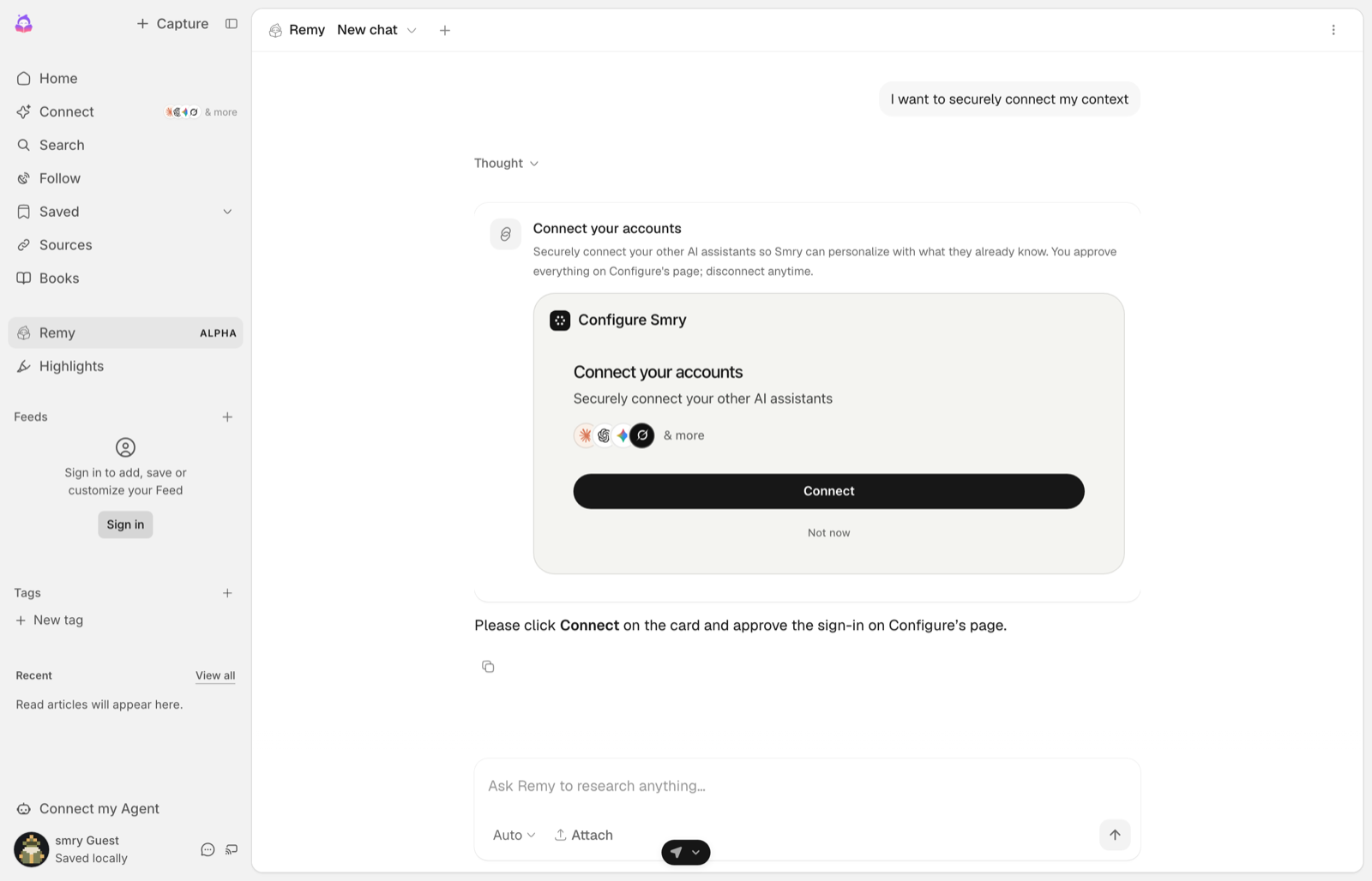
An MCP app is a page Configure serves and your page hosts in an iframe. That boundary is the point: the card renders Configure's markup, not yours, so the consent text, the permission list and the Connect button are the ones Configure shipped, and the page around them cannot restyle or reword them. The host script owns the iframe, sizes it, passes the theme in, and delivers the card's events back to you. resourceUri names the version, and every version keeps serving, so a card mounted today keeps working when a newer one ships.
The connect() result comes from your server, built with the same handle as the rest of the integration:
ts
import { Configure } from "configure";

export const configure = new Configure({
  apiKey: process.env.CONFIGURE_API_KEY,   // sk_..., server only
  agent: process.env.CONFIGURE_AGENT,      // your agent handle
});

export const profileFor = (userId: string) => configure.profile({ externalId: userId });ts
const connect = await profileFor(user.id).connect(); // hand this to the page, unchangedhtml
<script src="https://api.configure.dev/mcp-apps/configure-mcp-host.js"></script>js
ConfigureMcpAppHost.mount({
  container: el,                          // where the card renders in the thread
  resourceUri: "ui://configure/connect/v8.html",
  result: connect,                        // the connect() result, exactly as returned
  agentName: "Your App",                  // becomes the card title
});
mount() also accepts theme: "light" | "dark", and it returns a handle with element, iframe, dispose() and setTheme(). Call dispose() when the component unmounts, or a single-page app leaves the card's iframe behind, and setTheme() when your app's theme changes, because the card reads the theme once at mount.
The card's link is minted per user and expires; read expires_at on the result. That is why this page shows a capture rather than a mounted card: a card on a docs page would be holding a link that dies.
Approval card
For the two tools that change the outside world, sending an email and creating an event, the bundle ships a card that asks the user first. It shows the tool and its parameters, times out to Deny, and answers with one event.
html
<configure-tool-approval
  action-id="call_123"
  tool="configure_email_send"
  timeout-seconds="60"
></configure-tool-approval>
<script>
  const card = document.querySelector("configure-tool-approval");
  card.params = { to: "sam@example.com", subject: "Intro" };        // a property, not an attribute
  card.addEventListener("configure:tool-approve", (e) => runTool(e.detail.actionId));
  card.addEventListener("configure:tool-deny", (e) => skipTool(e.detail.actionId));
</script>
configure:tool-always-allow fires when the user chooses to stop being asked for that tool; remembering that choice is yours.
Attributes
On the raw <configure-personalization-button>:
| Attribute | Default | What it does |
|---|---|---|
variant | menu | menu or integration |
external-id | Your user id, so the connection lands on the profile your server reads | |
connectors | Which apps the flow offers, comma separated | |
personalization-label | The text of the Personalization row | |
placeholder | Placeholder text in the composer slot | |
manual | false | Announce events only; never open the flow |
hide-images, hide-files | false | Remove the image or file rows from the + menu |
image-label, file-label | Text of the image and file rows | |
max-visible | How many recent items the menu lists | |
show-actions, show-settings | Show the actions row and the settings row |
Events the element announces: configure:personalization-open and configure:personalization-toggle as the flow opens and closes, configure:personalization-menu-toggle for the + menu, configure:linked when the link completes, configure:image-select and configure:file-select for the attachment rows, and configure:settings-press.
The buttons are real buttons: keyboard reachable, with a visible focus ring, and still on the page at 375px wide.